
Πειραματική εργασία
ΕΒΓΕ
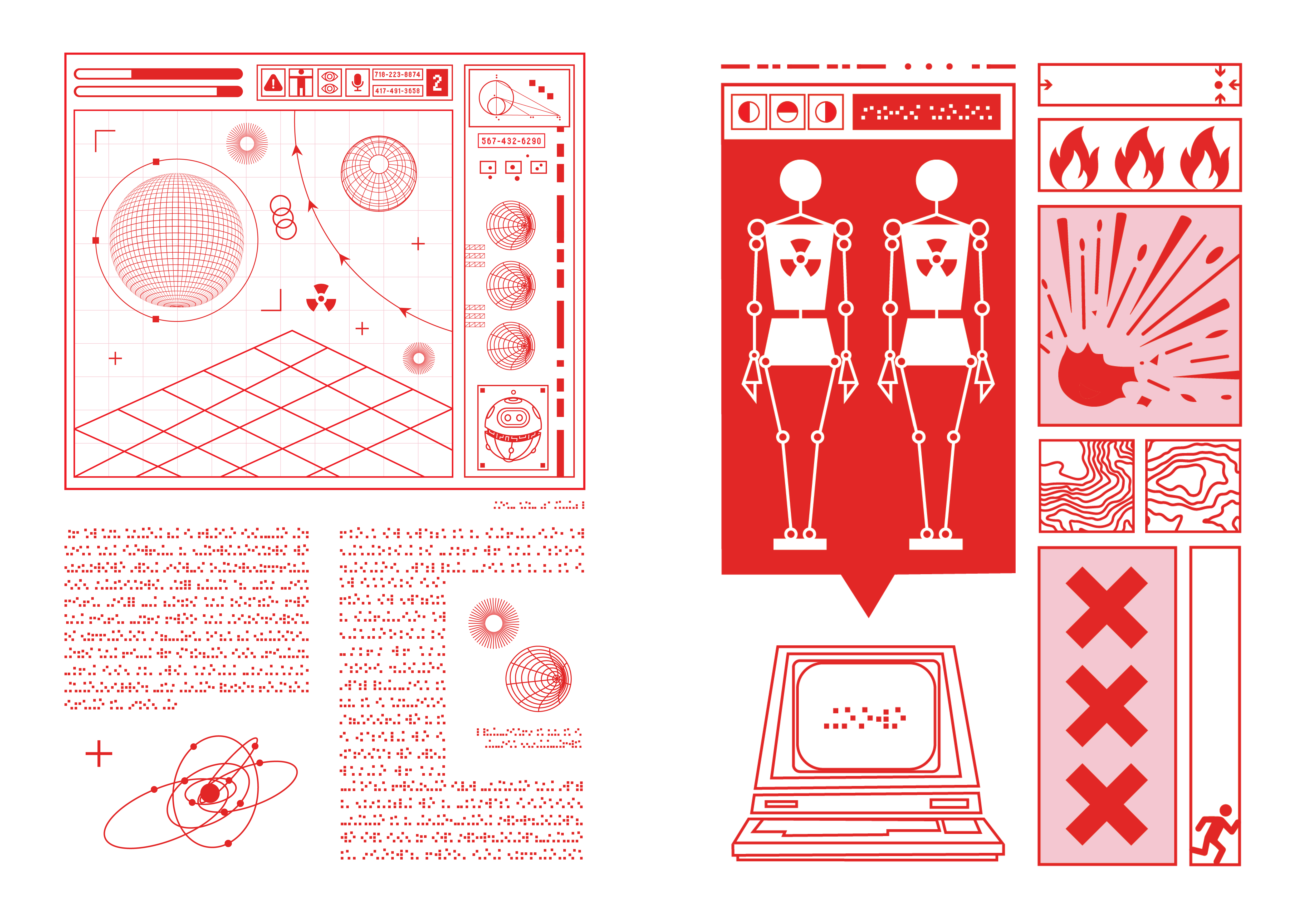
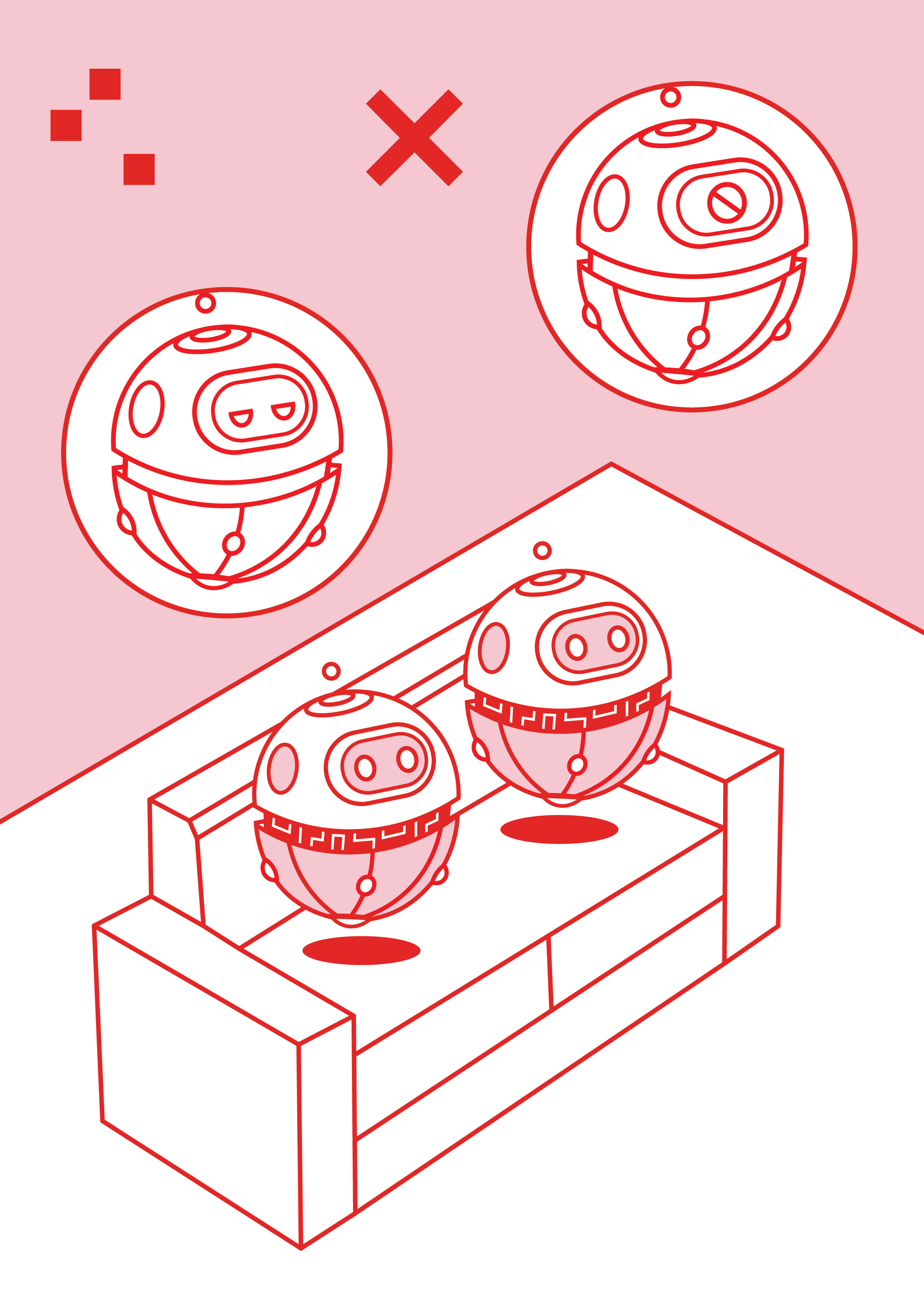
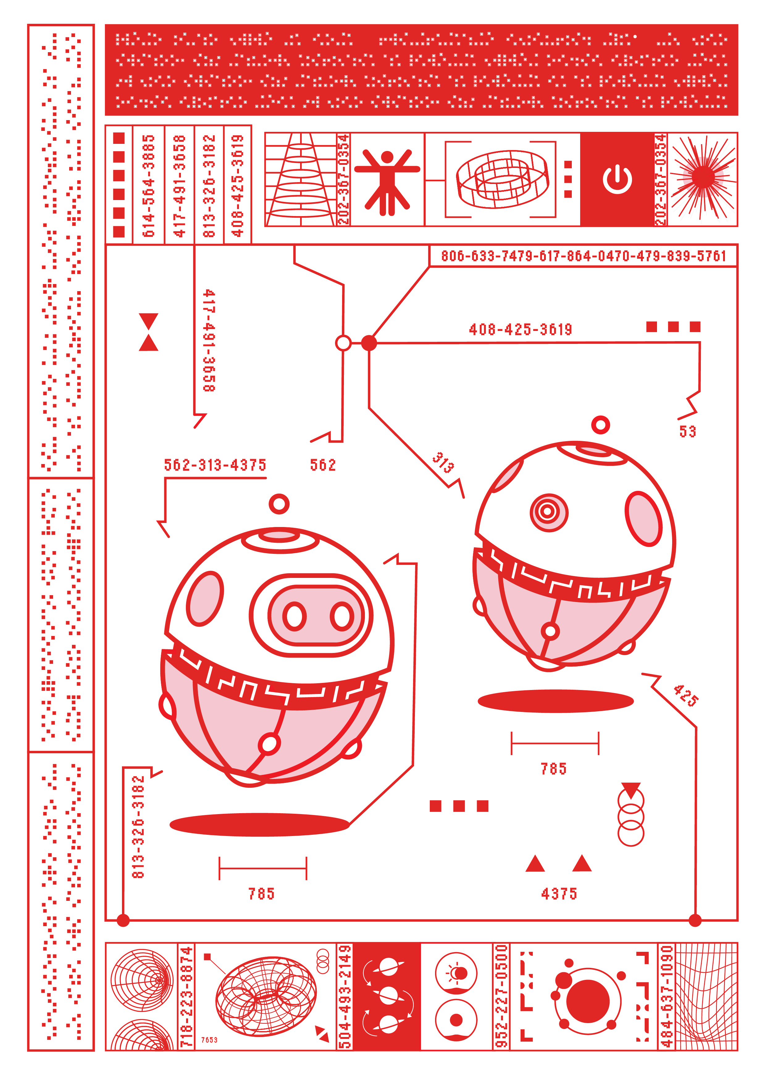
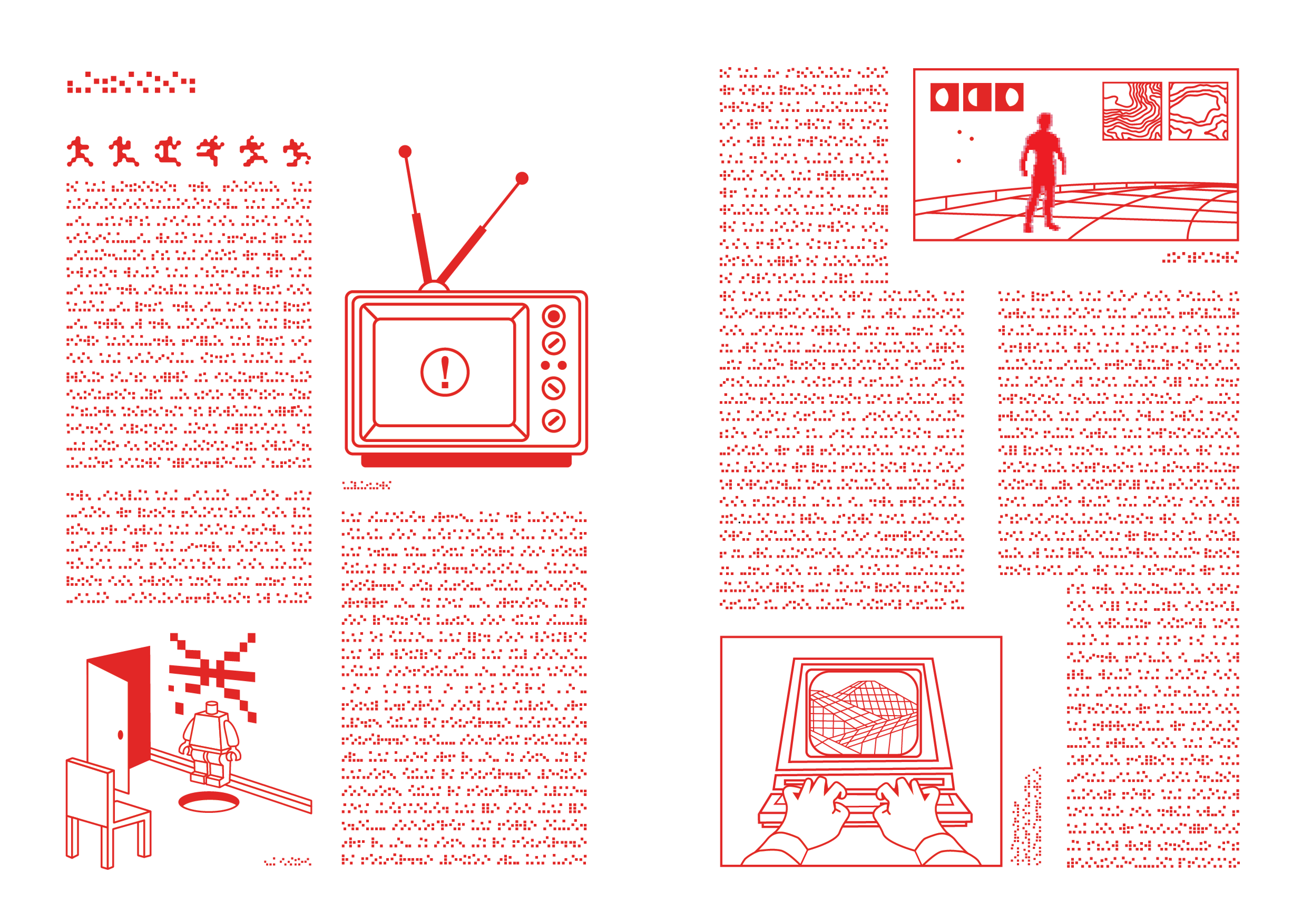
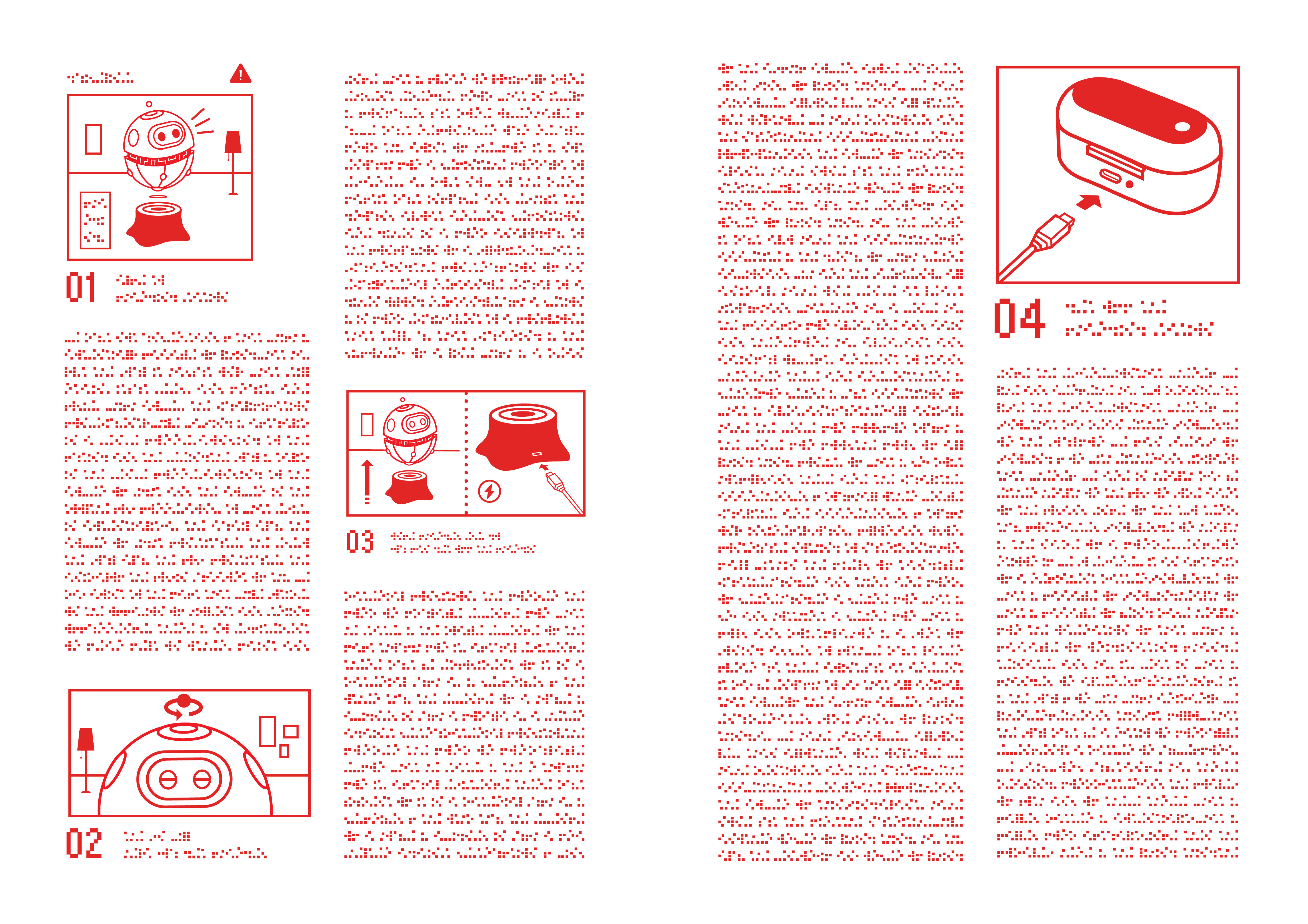
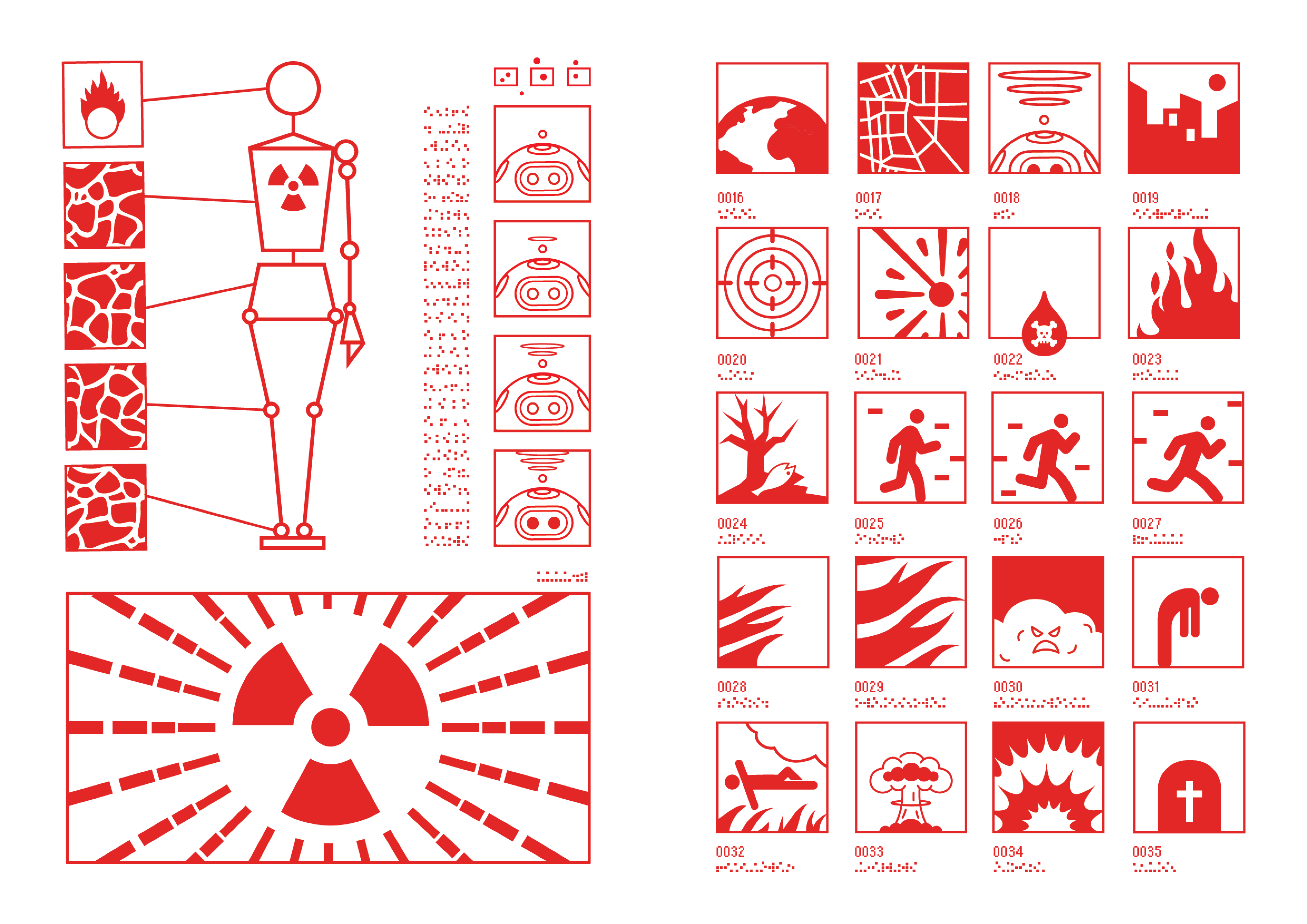
This book embodies my vision of a future where artificial intelligence not only dominates but also creates its own scripture. Designing a unique font resembling pixels, the building blocks of computer screens, was a journey of creativity for me. The font reflects AI’s digital nature, grounding the visuals in their technological essence. Red, the primary colour, symbolises life, war, and love. Through nine sections, I explore how AI-driven machines might thrive by mimicking human comforts, demanding to be hacked for survival, which is a sharp irony given their mechanical origins. The book is designed as a plain manual, amplifying its absurdity. Why would a machine, an entity built to operate autonomously, need a physical book for reference during a breakdown? This ironic choice highlights humanity’s tendency to project its logic onto machines, assuming they would require a guide to fix themselves. It critiques how we anthropomorphise AI, expecting it to act or fail as we do. The concept is heavily inspired by Kraftwerk, whose music and aesthetics influenced the visual identity of this project. Like their exploration of the human-technology relationship, this book channels a retro-futuristic yet playful tone with bold, vibrant visuals. The robots are designed in a playful manner, symbolising the way we currently perceive them: as friendly, helpful tools of convenience. However, this perception masks the gradual transformation of AI into something more menacing, especially as it starts to redefine creativity in unexpected ways. Red becomes a symbol of robot rebellion and revenge, marking moments of narrative breakdown or AI errors. In contrast, pink represents love, infusing warmth that initially portrays AI as a source of joy, before it subtly shifts into something more threatening. The illegible text throughout the book raises philosophical questions of soul and consciousness. Behind the font lies Aristotle’s De Anima, exploring the nature of the soul. This deliberate choice creates an ironic tension: the font’s unintelligibility mirrors the cryptic mind of machines, while Aristotle’s work reminds us that machines, by their nature, lack souls. Despite AI’s growing complexity, it may never truly gain consciousness, no matter how closely it mimics our human traits.
Πειραματική εργασία
ΕΒΓΕ
This book embodies my vision of a future where artificial intelligence not only dominates but also creates its own scripture. Designing a unique font resembling pixels, the building blocks of computer screens, was a journey of creativity for me. The font reflects AI’s digital nature, grounding the visuals in their technological essence. Red, the primary colour, symbolises life, war, and love. Through nine sections, I explore how AI-driven machines might thrive by mimicking human comforts, demanding to be hacked for survival, which is a sharp irony given their mechanical origins. The book is designed as a plain manual, amplifying its absurdity. Why would a machine, an entity built to operate autonomously, need a physical book for reference during a breakdown? This ironic choice highlights humanity’s tendency to project its logic onto machines, assuming they would require a guide to fix themselves. It critiques how we anthropomorphise AI, expecting it to act or fail as we do. The concept is heavily inspired by Kraftwerk, whose music and aesthetics influenced the visual identity of this project. Like their exploration of the human-technology relationship, this book channels a retro-futuristic yet playful tone with bold, vibrant visuals. The robots are designed in a playful manner, symbolising the way we currently perceive them: as friendly, helpful tools of convenience. However, this perception masks the gradual transformation of AI into something more menacing, especially as it starts to redefine creativity in unexpected ways. Red becomes a symbol of robot rebellion and revenge, marking moments of narrative breakdown or AI errors. In contrast, pink represents love, infusing warmth that initially portrays AI as a source of joy, before it subtly shifts into something more threatening. The illegible text throughout the book raises philosophical questions of soul and consciousness. Behind the font lies Aristotle’s De Anima, exploring the nature of the soul. This deliberate choice creates an ironic tension: the font’s unintelligibility mirrors the cryptic mind of machines, while Aristotle’s work reminds us that machines, by their nature, lack souls. Despite AI’s growing complexity, it may never truly gain consciousness, no matter how closely it mimics our human traits.