
Saronic Ferries
Πρωτότυπη Γραμματοσειρά
Έπαινος
Πρωτότυπη Γραμματοσειρά
Έπαινος
Πελάτης
Saronic Ferries
Creative Director
ΜΙΧΑΛΗΣ ΓΕΩΡΓΙΟΥ
Creative Director
ΔΗΜΗΤΡΗΣ ΣΤΕΦΑΝΙΔΗΣ
Senior Design Manager
ΣΟΦΙΑ ΚΩΣΤΑΚΗ
Motion Designer
KRISTIANA GEGAJ
Μotion Designer
ΔΗΜΗΤΡΗΣ ΜΑΤΖΟΥΡΑΝΗΣ
Designer
KΩΝΣΤΑΝΤΙΝΟΣ ΜΟΥΧΑ
Τype Designer
ΓΙΩΡΓΟΣ ΤΡΙΑΝΤΑΦΥΛΛΑΚΟΣ
Περιγραφή
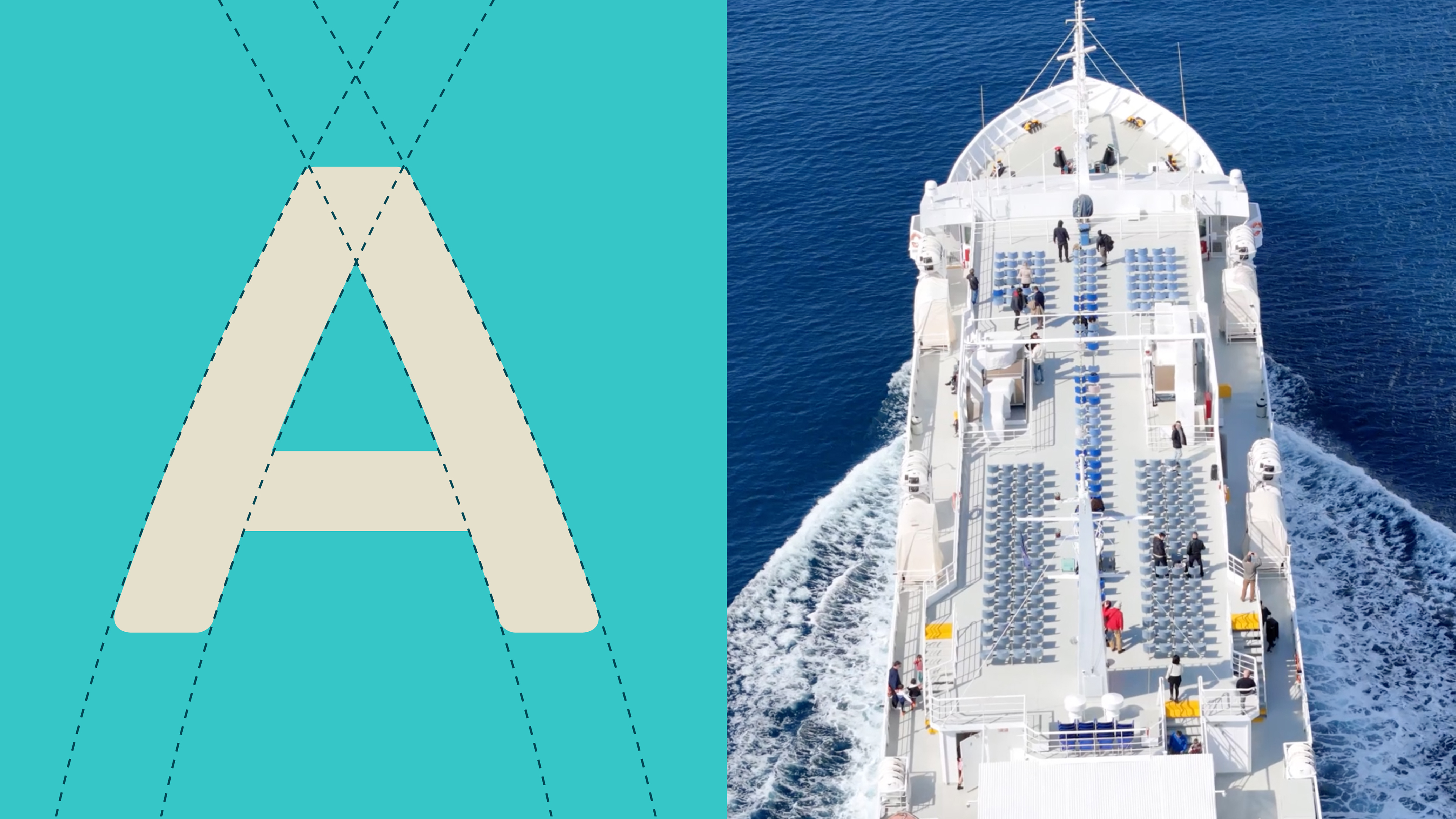
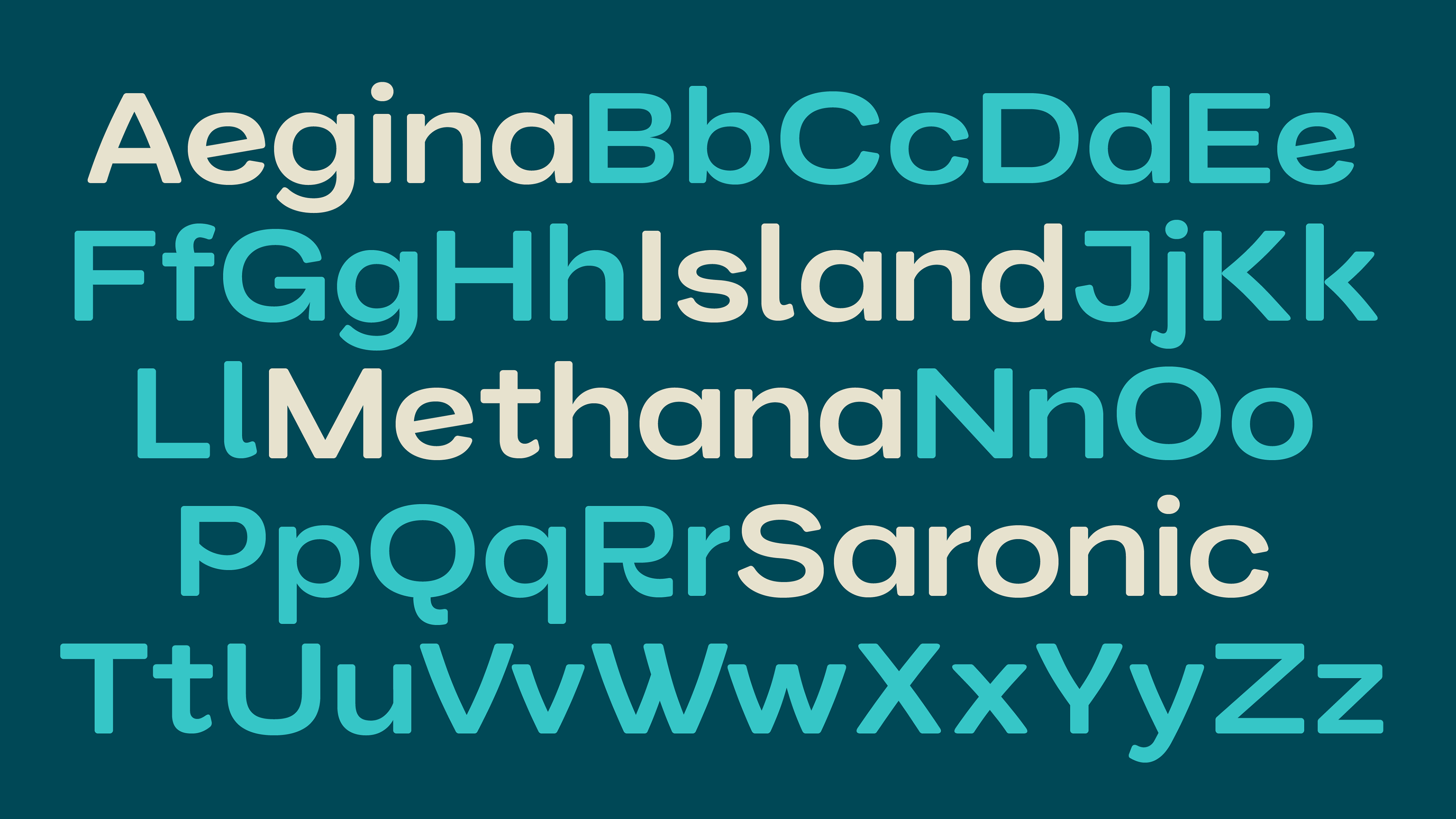
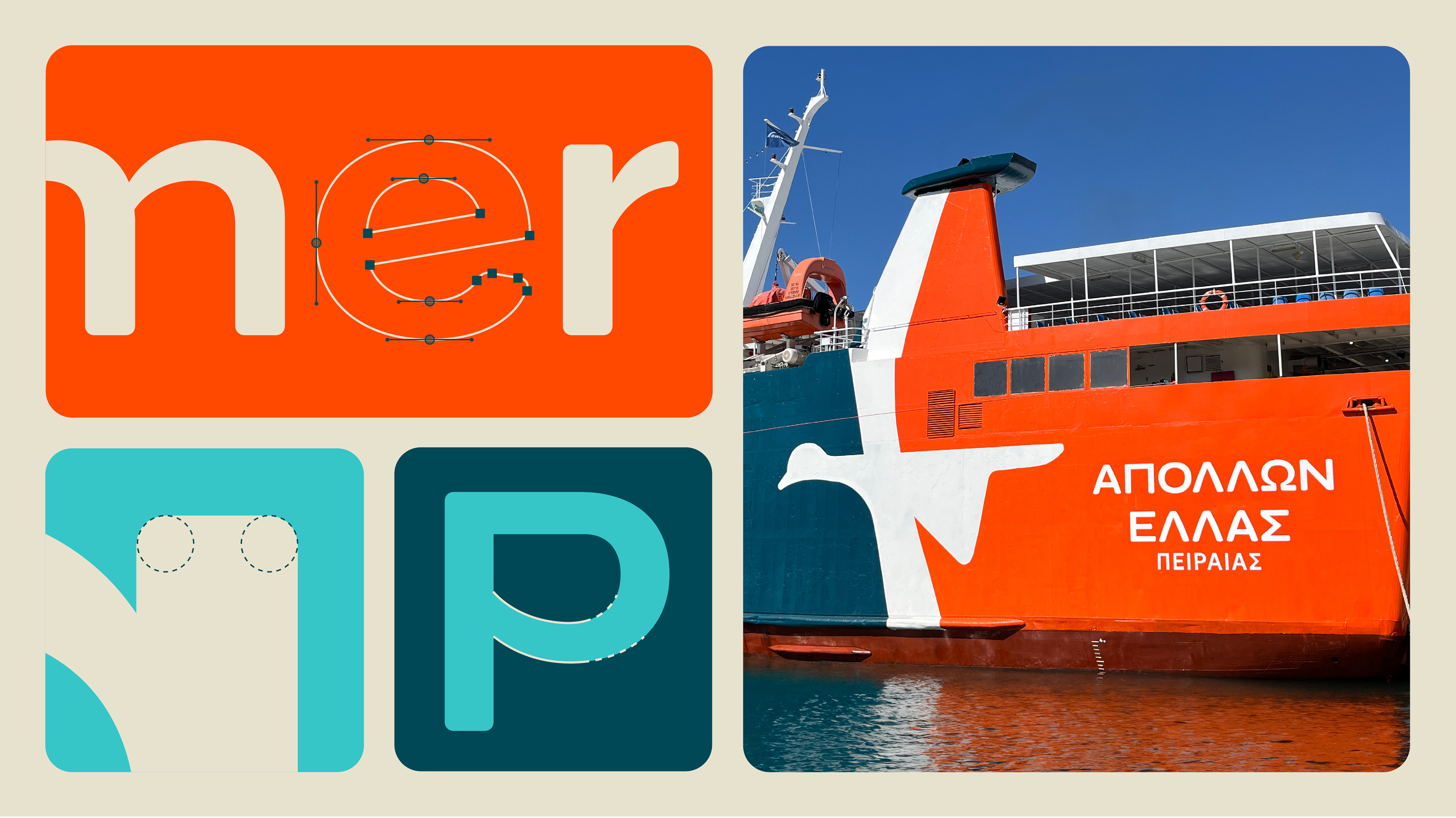
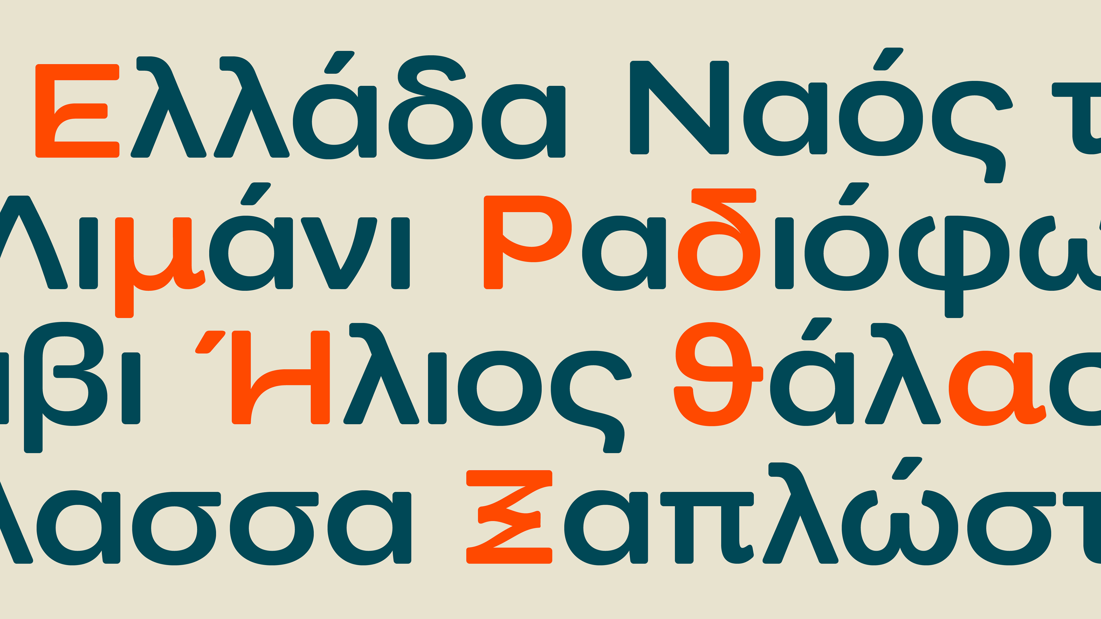
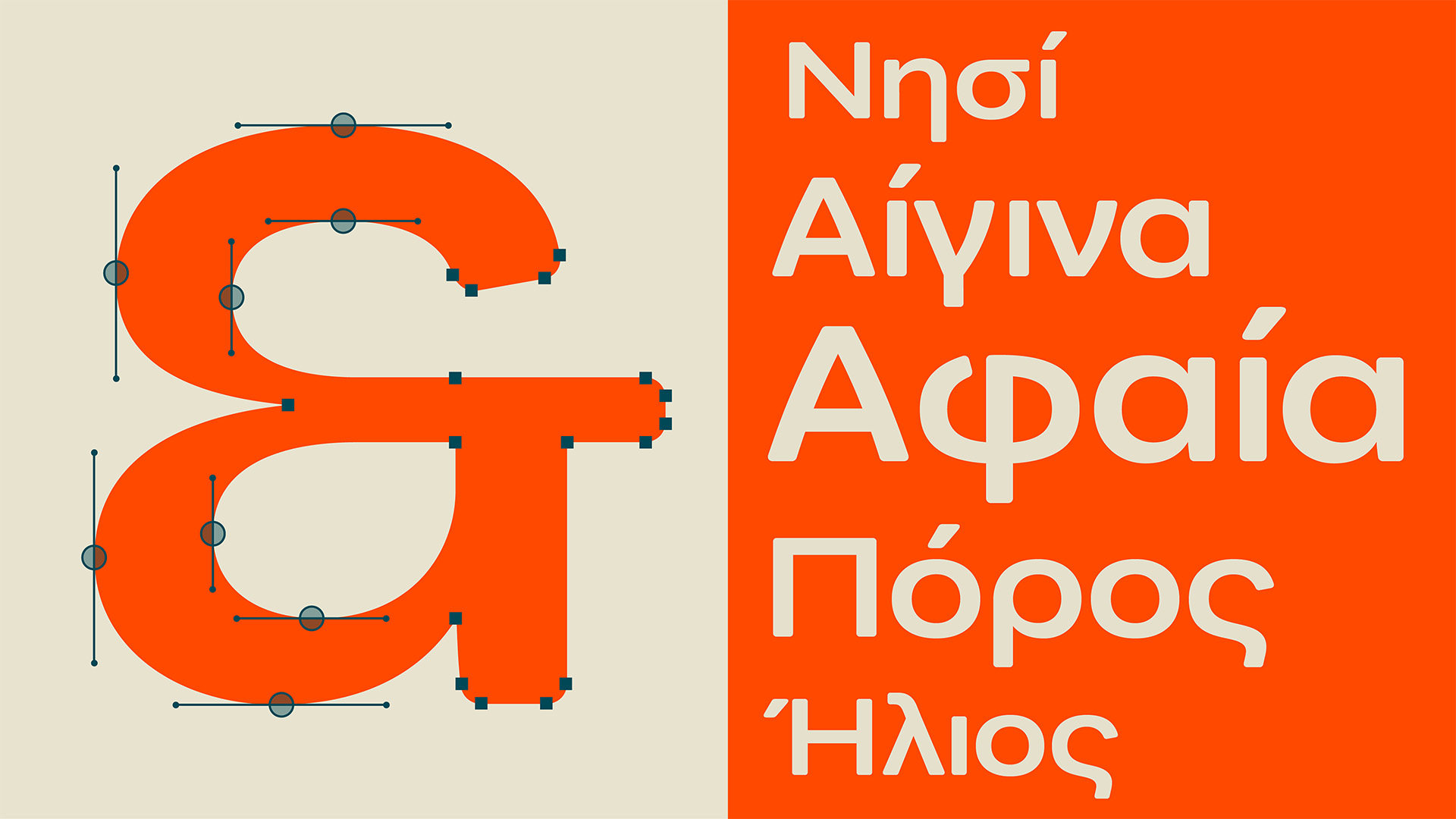
Designed exclusively for Saronic Ferries, Saronic font functions as a unifying element across the brand’s new identity. Reflecting the company’s ambition to be a reliable travel companion across the Saronic Sea, it draws inspiration from the experience of travel itself. Rounded corners, increased counter space, curved diagonals and expressive letterforms enhance the friendliness and dynamism of the font, while reinforcing the brand’s welcoming and human-centric character.
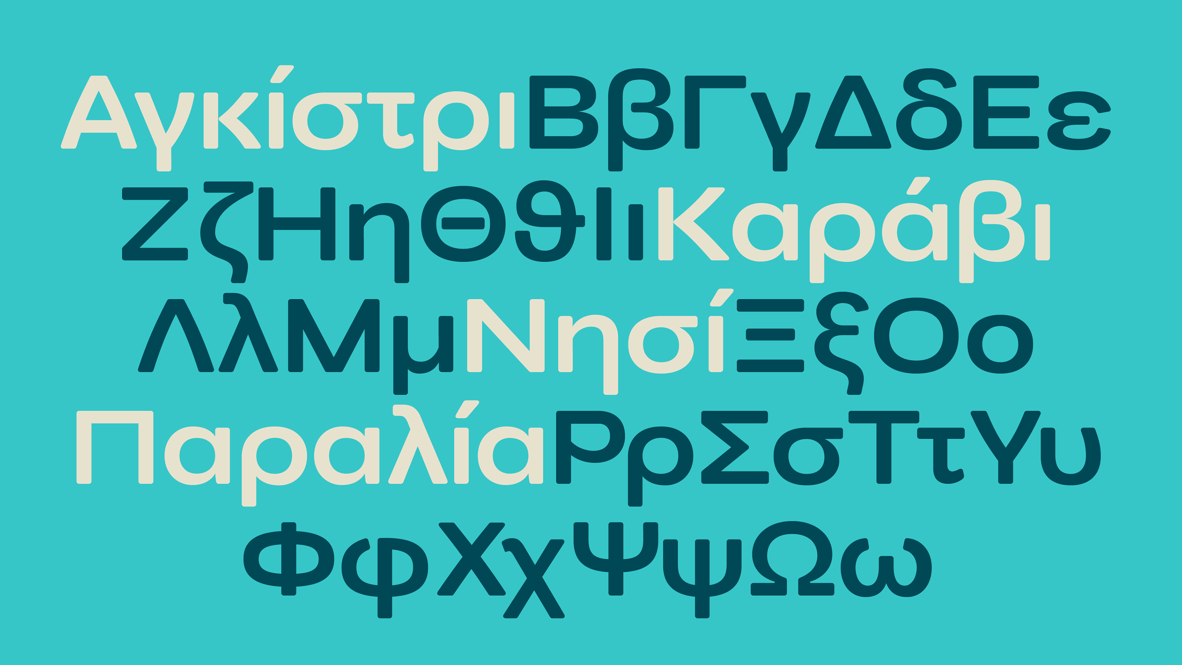
Supporting both Latin and Greek scripts, the typeface ensures consistency across languages. Special attention was given to the Greek lowercase, which balances expressiveness with readability, offering a contemporary tone rooted in typographic tradition. Stylistic alternates allow for flexible applications, and numerals have been refined for optimal legibility in signage and digital interfaces.
The result is a versatile typeface that is both technically robust and emotionally resonant—friendly, clear, and true to the spirit of the journey.
Saronic Ferries
Πρωτότυπη Γραμματοσειρά
Έπαινος
Πρωτότυπη Γραμματοσειρά
Έπαινος
Πελάτης
Saronic Ferries
Creative Director
ΜΙΧΑΛΗΣ ΓΕΩΡΓΙΟΥ
Creative Director
ΔΗΜΗΤΡΗΣ ΣΤΕΦΑΝΙΔΗΣ
Senior Design Manager
ΣΟΦΙΑ ΚΩΣΤΑΚΗ
Motion Designer
KRISTIANA GEGAJ
Μotion Designer
ΔΗΜΗΤΡΗΣ ΜΑΤΖΟΥΡΑΝΗΣ
Designer
KΩΝΣΤΑΝΤΙΝΟΣ ΜΟΥΧΑ
Τype Designer
ΓΙΩΡΓΟΣ ΤΡΙΑΝΤΑΦΥΛΛΑΚΟΣ
Περιγραφή
Designed exclusively for Saronic Ferries, Saronic font functions as a unifying element across the brand’s new identity. Reflecting the company’s ambition to be a reliable travel companion across the Saronic Sea, it draws inspiration from the experience of travel itself. Rounded corners, increased counter space, curved diagonals and expressive letterforms enhance the friendliness and dynamism of the font, while reinforcing the brand’s welcoming and human-centric character.
Supporting both Latin and Greek scripts, the typeface ensures consistency across languages. Special attention was given to the Greek lowercase, which balances expressiveness with readability, offering a contemporary tone rooted in typographic tradition. Stylistic alternates allow for flexible applications, and numerals have been refined for optimal legibility in signage and digital interfaces.
The result is a versatile typeface that is both technically robust and emotionally resonant—friendly, clear, and true to the spirit of the journey.