The Breeder
Περιοδικό
Έπαινος
Περιοδικό
Έπαινος
Πελάτης
The Breeder gallery
Creative Director/Designer
Νίκος Γεωργόπουλος
Graphic Designer
Γιάννης Χαριτίδης
Founder/Editorial Director
Γιώργος Βαμβακίδης
Founder/Editorial Director
Στάθης Παναγούλης
Περιγραφή
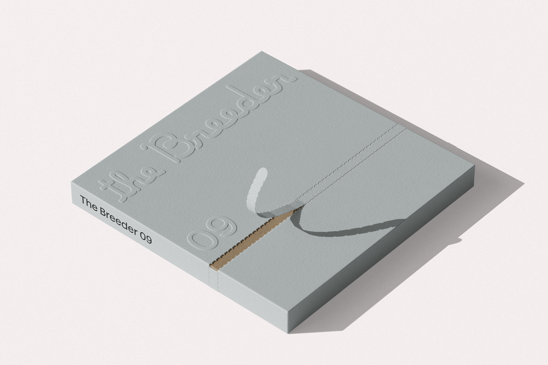
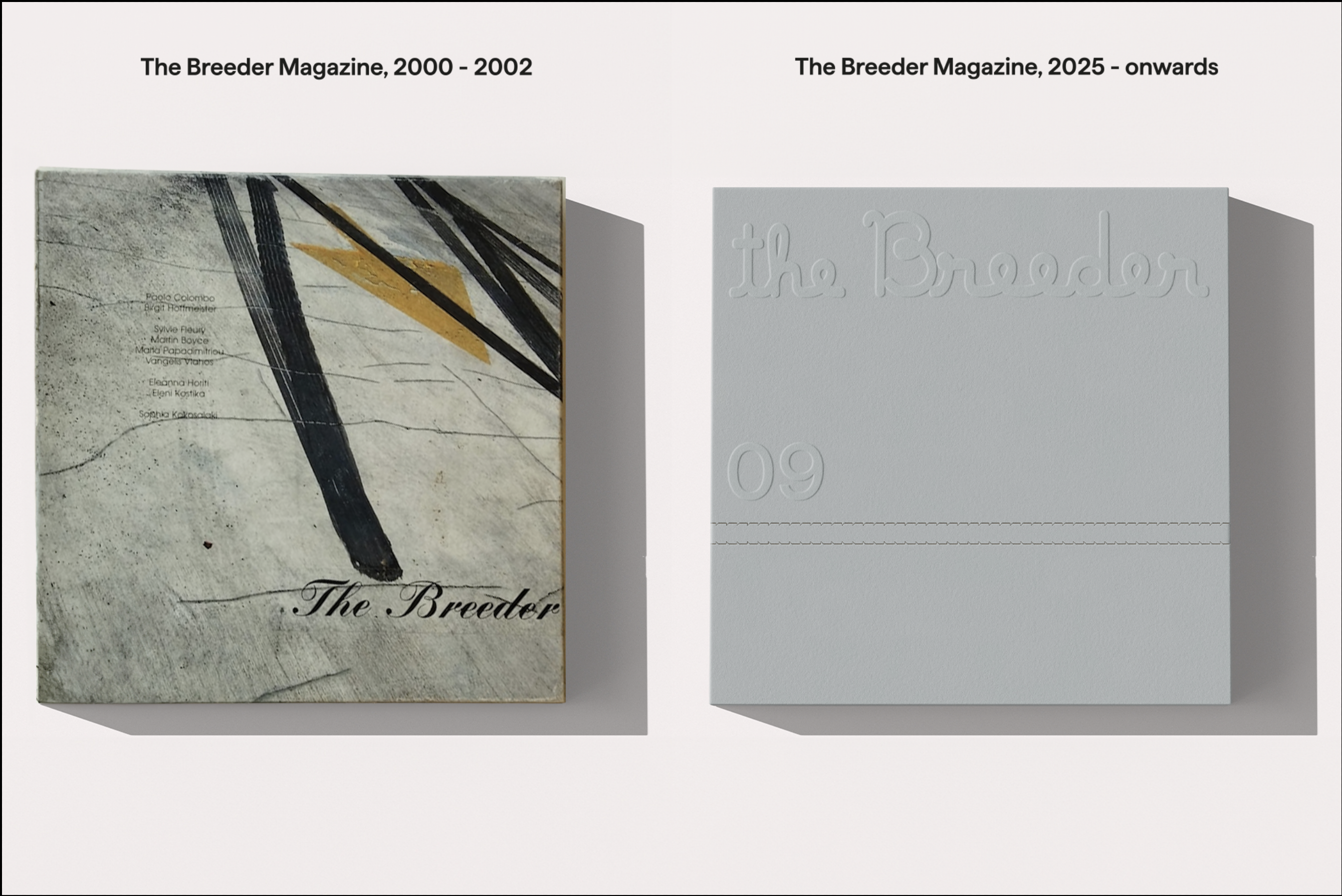
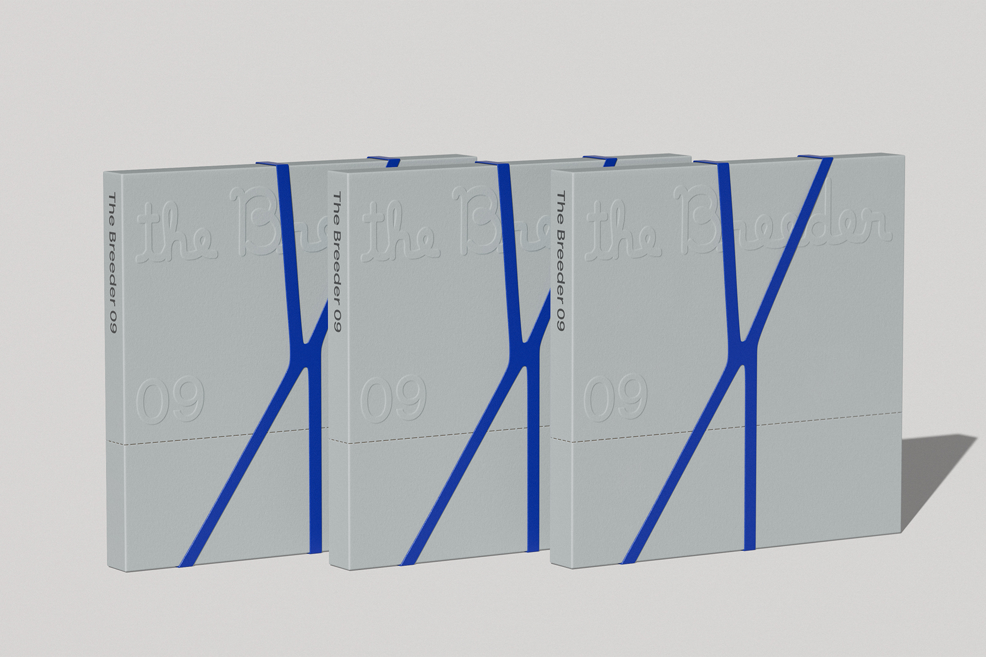
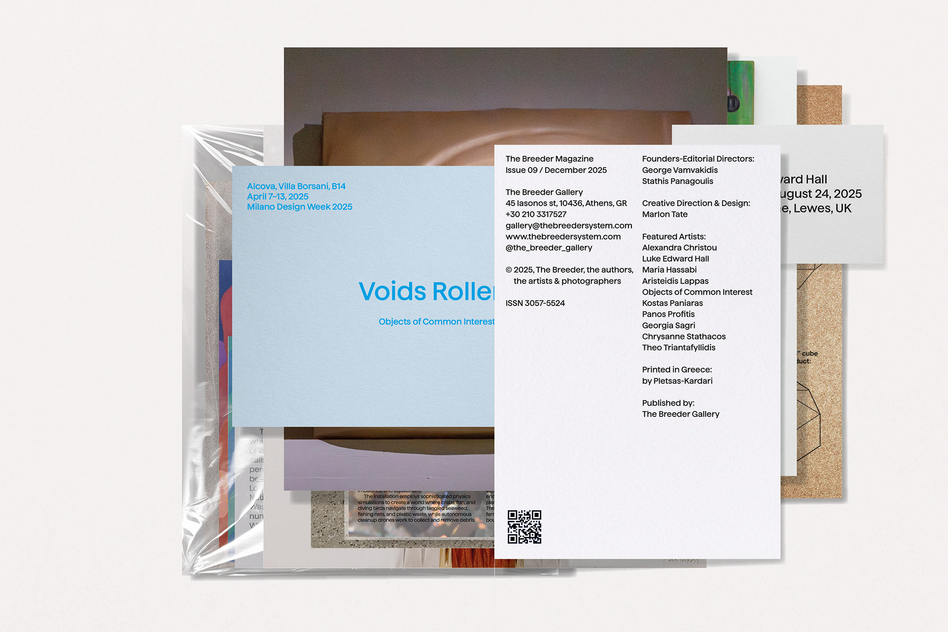
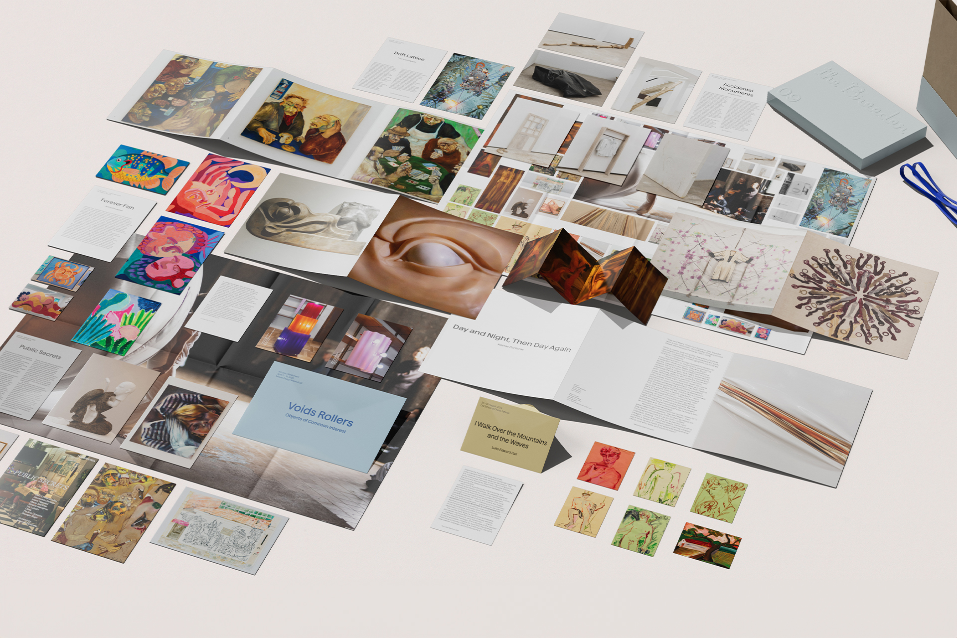
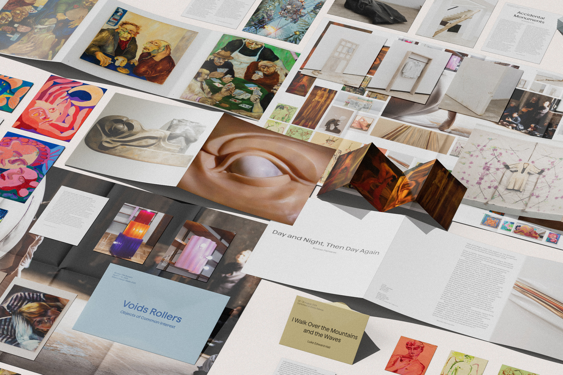
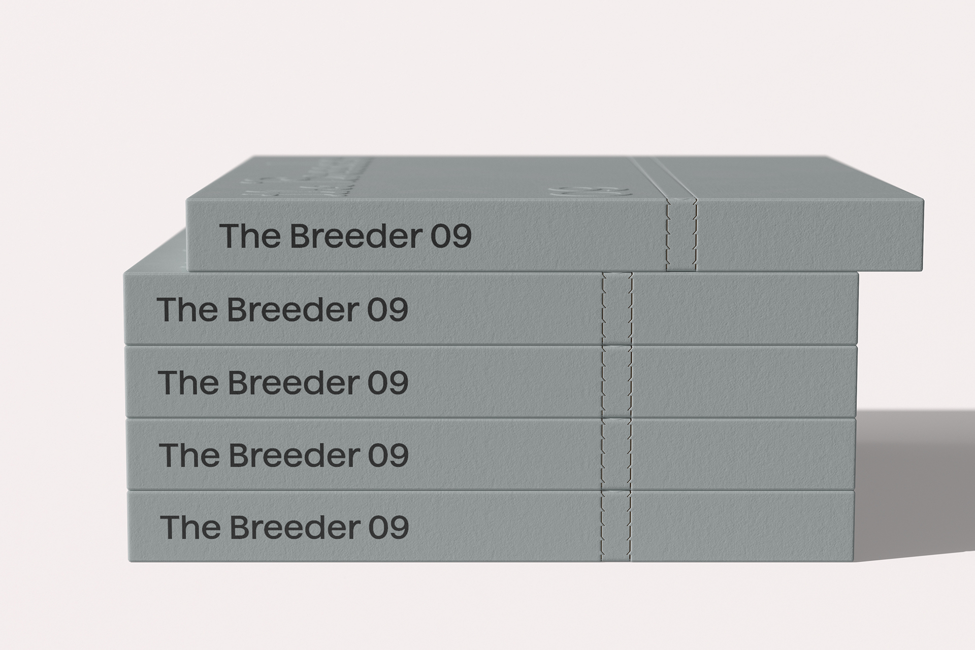
Founded in 2002, The Breeder is a contemporary art gallery in Athens, known for its influential role in shaping the city’s contemporary art scene. Not many people know, however, that The Breeder started life as a magazine before the idea of a gallery blossomed. The Breeder magazine subverted traditional art publishing through a square format. 25 years later, the gallery is relaunching the magazine as its editorial platform and commissioned us to take over the editorial and creative art direction. The challenge was to honour the magazine’s experimental origins while translating its ethos into a credible contemporary art publication for 2025. Inspired by Marcel Duchamp’s ‘La Boîte-en-valise’’ and PIL’s 1979 'Metal box', we conceived the magazine as the Gallery’s fragmented universe in a box. Retaining its signature square format, we repositioned the box not as packaging but as the publication’s cover and integral structural element. Inside, unbound pages of varying sizes and paper stocks, folded posters, and a coloured rubber band create a tactile, modular reading experience. Each biannual issue features a distinct cover colour and a custom-drawn logotype, re-establishing the magazine as both collectible object and evolving curatorial platform.
The Breeder
Περιοδικό
Έπαινος
Περιοδικό
Έπαινος
Πελάτης
The Breeder gallery
Creative Director/Designer
Νίκος Γεωργόπουλος
Graphic Designer
Γιάννης Χαριτίδης
Founder/Editorial Director
Γιώργος Βαμβακίδης
Founder/Editorial Director
Στάθης Παναγούλης
Περιγραφή
Founded in 2002, The Breeder is a contemporary art gallery in Athens, known for its influential role in shaping the city’s contemporary art scene. Not many people know, however, that The Breeder started life as a magazine before the idea of a gallery blossomed. The Breeder magazine subverted traditional art publishing through a square format. 25 years later, the gallery is relaunching the magazine as its editorial platform and commissioned us to take over the editorial and creative art direction. The challenge was to honour the magazine’s experimental origins while translating its ethos into a credible contemporary art publication for 2025. Inspired by Marcel Duchamp’s ‘La Boîte-en-valise’’ and PIL’s 1979 'Metal box', we conceived the magazine as the Gallery’s fragmented universe in a box. Retaining its signature square format, we repositioned the box not as packaging but as the publication’s cover and integral structural element. Inside, unbound pages of varying sizes and paper stocks, folded posters, and a coloured rubber band create a tactile, modular reading experience. Each biannual issue features a distinct cover colour and a custom-drawn logotype, re-establishing the magazine as both collectible object and evolving curatorial platform.